无缝循环滚动是浏览器中一种常见的网页效果,在屏幕长宽受限的情况下,用于展现更多数据,在图片轮播、公告栏和大屏滚动等场景很常见。本文将介绍几种在浏览器中,实现的无缝循环滚动效果的思路。
循环滚动的原理
界面的循环滚动,依靠 CSS 关键帧实现,一个关键帧的循环就成了动画,这就像循环播放的 GIF 一样,中间的画面只是一次片段,而这个片段是由物体的一次运动组成。
首先,我们需要定义一个 0% 到 100% 的位移关键帧,使用 translateY 或 translateX 控制元素的位移距离。此时,这个关键帧就是一个片段,执行一次运动。
1
2
3
4
5
6
7
8
9
| @keyframes scroll {
0% {
transform: translateY(0);
}
100% {
transform: translateY(500px);
}
}
|
然后,我们需要为元素应用关键帧动画效果,通过使用 animation 我们可以定义关键帧的一些状态,例如关键播放的速度、次数、状态和效果。
为了让关键帧无限循环,我们需要将其设置为 infinite。此外,为了让关键帧循环更加自然,可以为其设置播放效果为 linear,使其保持匀速运动,这样每次的关键帧前进的时间和距离都是相同的。
1
2
3
| .element {
animation: scroll 5s linear infinite;
}
|
当为元素应用了动画后,关键帧就会开始循环的执行运动。这实际上是一种视觉效果,动画中的关键帧是一直在执行运动的,只是每次片段的开始和结尾都是衔接的,我们看不出区别,也就无法感知。
现在,我们理解了循环滚动的原理,动画的循环就是同一个关键帧在不停的衔接播放。
无缝循环滚动的方式
我们了解到的循环,实际上关键帧都是在可视范围内的移动的。但是,如果关键帧的运动移动到了可视范围之外,那么这个缺少的部分,就会产生一段空白,而这个空白正好是可视范围的高度或宽度。当下一个关键帧播放时,可视范围内就会出现闪烁。
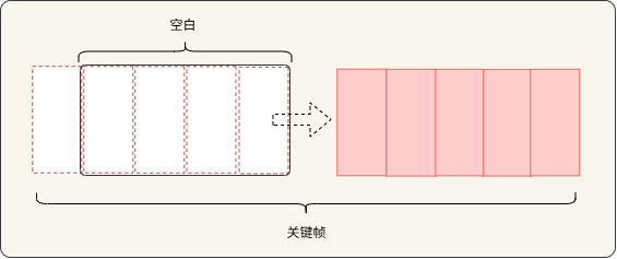
那么,为了使关键帧能够头尾衔接,实现无缝滚动,就需要处理这段空白。于是,我们现在需要的就是将这个空白填补上,最直接的方式就是使用头部内容填充。
头部内容填充
我们可以将关键帧相同的内容,拼接到上一个关键帧的最后。当关键帧移动到可视范围之外时,重复的内容滚动到顶部就填充了可视范围的空白。
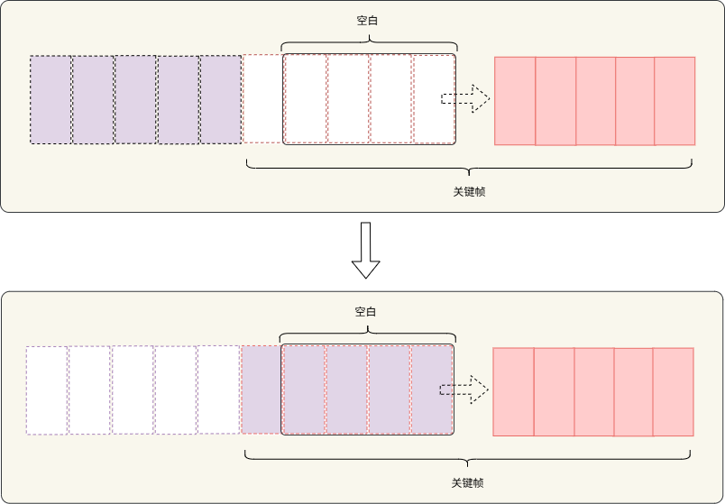
当然,这里的重复内容的数量,取决于需要多少内容才能铺满可视范围的高度或宽度。
此外,因为每个关键帧的运动速度和位移距离都是相同的,即使一个关键帧播放完毕,下一个关键帧也能够完美的重叠在滚动的布局上。
为了更好的确定重复元素的放置的位置,我们将关键帧播放的终点定在可视范围的顶部,然后将关键帧整个移动到外面。所以,就需要确定整个关键帧的长度,在浏览器中就是每个布局子项的高度总和。
例如,关键帧总共有 3 个子项目,每个子项的高度为 300px,那么关键帧的位移距离就是 900px。
1
2
3
4
5
6
7
8
9
10
| @keyframes scroll {
0% {
transform: translateY(0);
}
100% {
transform: translateY(-900px);
}
}
|
确定好关键帧全部移出可视范围的位移后,我们就可以为关键帧子项目添加重复的子项目了。
1
2
3
4
5
6
7
8
9
10
11
12
13
14
15
16
17
18
19
20
21
| <div class="carousel-track">
<div class="carousel-item">
<span>第一个项目</span>
</div>
<div class="carousel-item">
<span>第二个项目</span>
</div>
<div class="carousel-item">
<span>第三个项目</span>
</div>
<div class="carousel-item">
<span>第一个项目</span>
</div>
<div class="carousel-item">
<span>第二个项目</span>
</div>
<div class="carousel-item">
<span>第三个项目</span>
</div>
</div>
|
最后为关键帧添加无限循环的动画,调整一下播放的速度,就实现了无缝循环无限滚动。
1
2
3
4
5
6
7
8
9
10
11
12
13
14
15
16
17
18
19
20
21
22
23
24
25
26
27
28
29
30
31
32
33
34
35
36
37
38
39
40
41
42
43
44
45
46
47
48
49
50
51
52
53
54
55
56
57
58
59
60
61
62
63
64
65
66
67
68
69
70
71
72
73
74
75
76
77
78
79
80
81
82
83
84
85
86
87
88
89
90
91
92
93
94
95
96
97
98
99
100
101
102
103
| <!DOCTYPE html>
<html lang="zh-CN">
<head>
<meta charset="UTF-8">
<meta name="viewport" content="width=device-width, initial-scale=1.0">
<title>竖向无缝循环滚动</title>
<style>
* {
margin: 0;
padding: 0;
box-sizing: border-box;
}
body {
background: linear-gradient(135deg, #667eea 0%, #764ba2 100%);
display: flex;
justify-content: center;
align-items: center;
min-height: 100vh;
}
.carousel-container {
width: 400px;
height: 500px;
background: white;
border-radius: 20px;
overflow: hidden;
}
.carousel-track {
display: flex;
flex-direction: column;
animation: scroll 12s linear infinite;
}
.carousel-item {
height: 300px;
display: flex;
align-items: center;
justify-content: center;
font-size: 24px;
color: white;
}
.carousel-item:nth-child(3n+1) {
background: linear-gradient(135deg, #ff9a9e, #f6703f);
}
.carousel-item:nth-child(3n+2) {
background: linear-gradient(135deg, #ee90f5, #9a71ea);
}
.carousel-item:nth-child(3n) {
background: linear-gradient(135deg, #93fbe3, #a3d2fc);
}
@keyframes scroll {
0% {
transform: translateY(0);
}
100% {
transform: translateY(-900px);
}
}
.carousel-container:hover .carousel-track {
animation-play-state: paused;
}
</style>
</head>
<body>
<div class="carousel-container">
<div class="carousel-track">
<div class="carousel-item">
<span>第一个项目</span>
</div>
<div class="carousel-item">
<span>第二个项目</span>
</div>
<div class="carousel-item">
<span>第三个项目</span>
</div>
<div class="carousel-item">
<span>第一个项目</span>
</div>
<div class="carousel-item">
<span>第二个项目</span>
</div>
<div class="carousel-item">
<span>第三个项目</span>
</div>
</div>
</div>
</body>
</html>
|
但是,这种方式只适合确定了固定子项数量的场景,如果子项的数量是动态的,那么就需要动态地计算关键帧的偏移距离。
1
2
3
4
5
6
7
8
9
10
11
12
13
14
15
16
17
18
19
20
21
22
23
24
25
26
27
28
29
30
31
32
33
34
35
36
37
38
39
40
41
42
43
44
45
46
47
48
49
50
51
52
53
54
55
56
57
58
59
60
61
62
63
64
65
66
67
68
69
70
71
72
73
74
75
76
77
78
79
80
81
82
83
84
85
86
87
88
89
90
91
92
93
94
95
96
97
98
99
100
101
102
103
104
105
106
107
108
109
110
111
112
113
114
115
116
117
118
119
120
121
122
123
124
125
126
127
128
| <!DOCTYPE html>
<html lang="zh-CN">
<head>
<meta charset="UTF-8">
<meta name="viewport" content="width=device-width, initial-scale=1.0">
<title>竖向动态无缝循环滚动</title>
<style>
* {
margin: 0;
padding: 0;
box-sizing: border-box;
}
body {
background: linear-gradient(135deg, #667eea 0%, #764ba2 100%);
display: flex;
justify-content: center;
align-items: center;
min-height: 100vh;
}
.carousel-container {
width: 400px;
height: 500px;
background: white;
border-radius: 20px;
overflow: hidden;
}
.carousel-track {
display: flex;
flex-direction: column;
}
.carousel-item {
width: 100%;
height: 300px;
display: flex;
align-items: center;
justify-content: center;
font-size: 24px;
color: white;
}
.carousel-container:hover .carousel-track {
animation-play-state: paused;
}
</style>
</head>
<body>
<div class="carousel-container">
<div class="carousel-track" id="carouselTrack"></div>
</div>
<script>
const carouselTrack = document.getElementById('carouselTrack');
const fragment = document.createDocumentFragment();
const itemCount = 3 + Math.floor(Math.random() * 3);
const colorGradients = [
'linear-gradient(135deg, #ff9a9e, #f6703f)',
'linear-gradient(135deg, #ee90f5, #9a71ea)',
'linear-gradient(135deg, #93fbe3, #a3d2fc)',
'linear-gradient(135deg, #84fab0, #8fd3f4)',
'linear-gradient(135deg, #a6c1ee, #fbc2eb)'
];
let nthChildCSS = '';
Array.from({ length: itemCount }).forEach((_, i) => {
nthChildCSS += `
.carousel-item:nth-child(${itemCount}n+${i + 1}) {
background: ${colorGradients[i]};
}
`;
});
Array.from({ length: itemCount }).forEach((_, i) => {
const item = document.createElement('div');
item.className = 'carousel-item';
item.innerHTML = `<span>第${i + 1}个项目</span>`;
fragment.appendChild(item);
});
Array.from({ length: itemCount }).forEach((_, i) => {
const item = document.createElement('div');
item.className = 'carousel-item';
item.innerHTML = `<span>第${i + 1}个项目</span>`;
fragment.appendChild(item);
});
carouselTrack.appendChild(fragment);
const totalHeight = itemCount * 300;
const animationDuration = itemCount * 4;
const style = document.createElement('style');
style.innerHTML = `
.carousel-track {
animation: scroll ${animationDuration}s linear infinite;
}
@keyframes scroll {
0% {
transform: translateY(0);
}
100% {
transform: translateY(-${totalHeight}px);
}
}
${nthChildCSS}
`;
document.head.appendChild(style);
</script>
</body>
</html>
|
需要注意的是,子项目高度会受到内部 padding 的影响,因此需要将子项目 box-sizing 设置为 border-box,然后为其设置一个固定高度。另外,如果子项设置了 margin,那么也需要计入关键帧的偏移距离。
结语
至此,我们理解了在浏览器中的元素是如何实现无缝无限滚动的,无缝滚动只是一种视觉效果。除此之外,在浏览器中有还有很多通过视觉效果实现布局的特殊效果的场景,但是当我们了解原理后,就能很好理解了它们的实现方式。